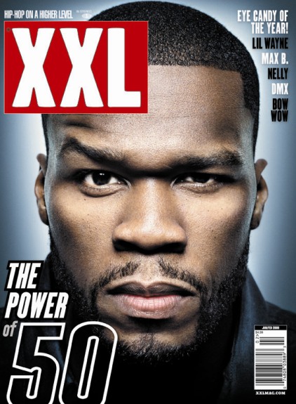
These are the final drafts for our Magazine advert.
as you can see, each draft uses similar location, matched lighting and costume, and also the same font. this is because we decided that the design of the advert should resemble and compliment the design and layout of our other ancillary text, the final video and the disc itself.
we have done this by taking the images for each product at the same time, aswell as filming a sequence for the video. by doing this, it has enabled our images to resemble shots used in the video as main aspects such as lighting match.
the fonts used will also match the disc and the digipak.
the images also contain the logo of the institution that could of produced and distributed the album if it was in reality, and also the logo of XXL magazine, a product that would contain items from this genre of music.


Each image also contains a made up comment from real, established institutions or artists, for instance Q magazine giving the product "5 out of 5", this not only adds to the realism of our product, but also represents the product as being of good quality and standard.
No comments:
Post a Comment